

GoCentroBus

GoCentroBus
UX RESEARCH • PRODUCT REDESIGN 2025
Enhancing GoCentro’s Usability to
Improve the Local Transit Experience
Platform:
Mobile App
Project Durations:
4-5 weeks
I did an in-depth user research, usability analysis, and feature redesign for the GoCentro Bus application, to identify and solve major usability gaps and overall reliability. The redesigned experience resulted in a more intuitive interface, clearer navigation, and features that aligned with real commuter scenarios, helping improve usability and support higher user adoption.
Project Overview
This project focuses on enhancing the usability and effectiveness of the GoCentro bus app, a transit tool intended for users commuting within Central New York. Despite its availability, many users rely on third-party apps due to GoCentro app’s un-intuitive design and limited features. The project aimed to investigate why users avoided the official app and how its design could be improved to meet their needs.
INITIAL OBSERVATION
A preliminary survey with 24 users revealed that less than 7% of participants used the GoCentroBus app, as many found it difficult to navigate and lacking modern features, which reduced trust and discouraged regular use. The vast majority depended on third-party navigation apps.
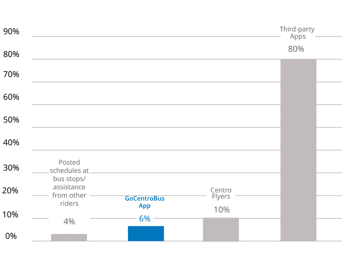
Transit Information Access Patterns
Target Audience
Daily Commuters
Students who use Centro buses to travel between campuses, dorms, and off-campus locations.
Working Professionals, commuting daily to workplaces who depend on reliable transportation for shift-based work.
Occasional Riders
First-time users who are looking for Centro Bus transit information.
Occasional visitors of central New York who rely on local transport.

User Research
EMPATHIZING
I stepped into the travelers’ journey to understand their real needs and frustrations by engaging with app users and also introducing to new users which included 15+ students, workers, and occasional travelers.

Identified Opportunities:

COMPETITOR ANALYSIS
I conducted research on competitor apps such as Google Maps, Moovit, and Transit, Greyhound combined with user interviews and Play Store reviews, to identify gaps in usability, navigation, and notification systems, as well as to understand general transit habits.

INTERVIEW, FIELD STUDY & OBSERVATIONS
During the survey participants were asked about their general commuting habits, studied usage patterns, and expectations from a transit app. They were also observed while simulating the entire journey from trip planning to boarding and completing contextual tasks such as:

IDENTIFIED PAIN POINTS
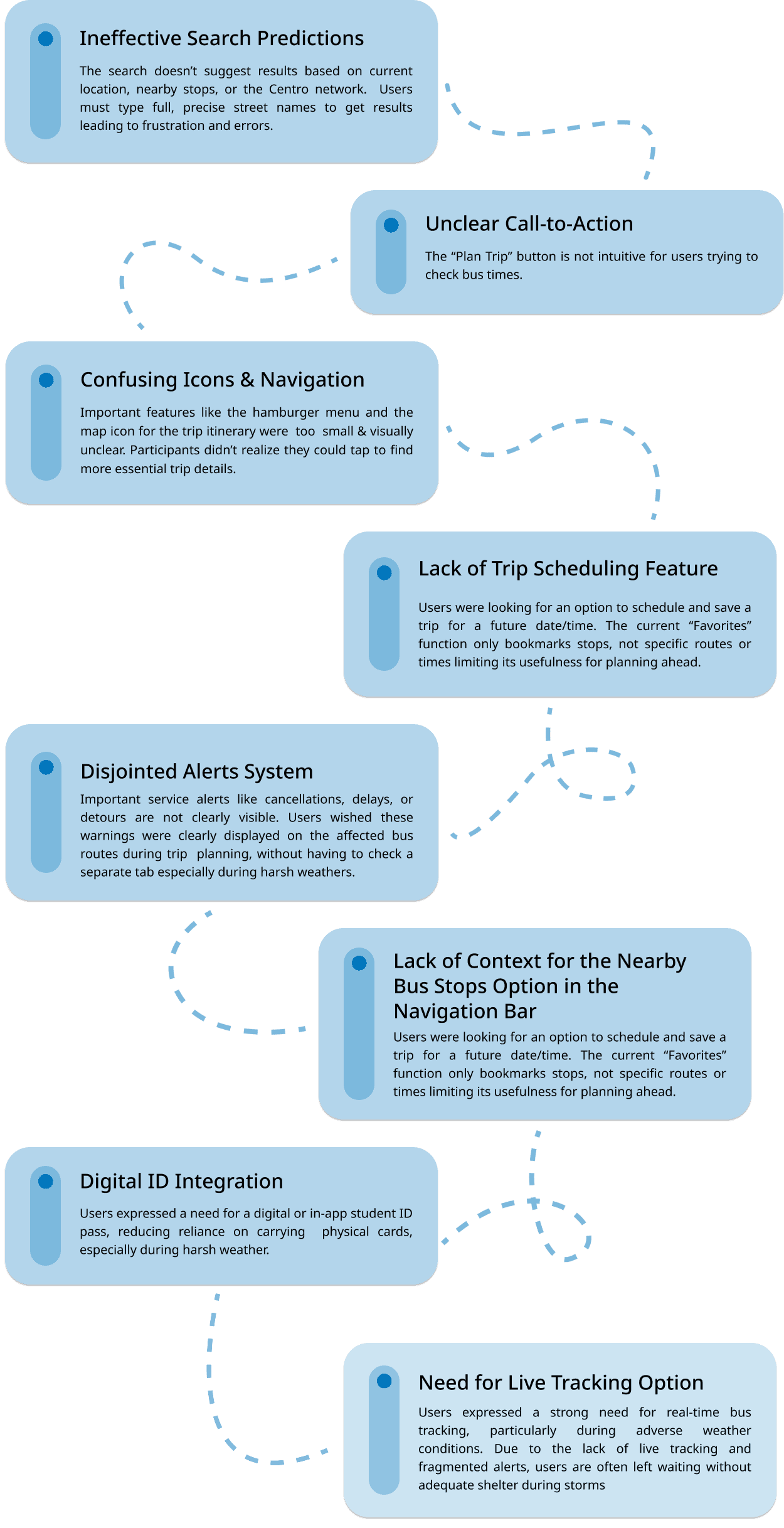

Affinity Diagram
After collecting the data, I reviewed my notes and categorized the feedback into themes. I used an affinity diagram approach to cluster related feedback and prioritize areas for improvement. Patterns emerged, showing both frequent and occasional users found the app less intuitive.

DEFINING
My research guided design improvements to address user needs and make the app more competitive.


Design Objectives
01 User - Friendly Interface
02 Consistency with Familiar Mental Models
03 Real-time Updates and Bus Tracking
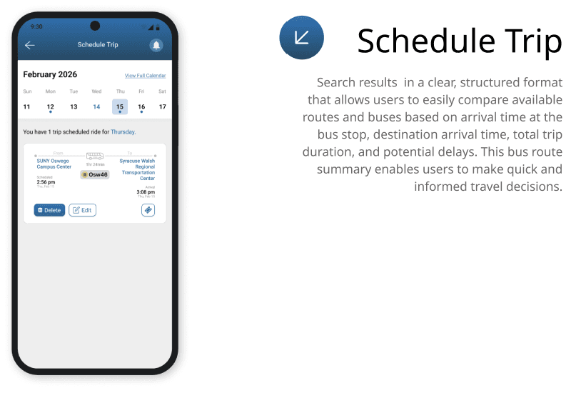
04 Trip Scheduling Options with Reminders
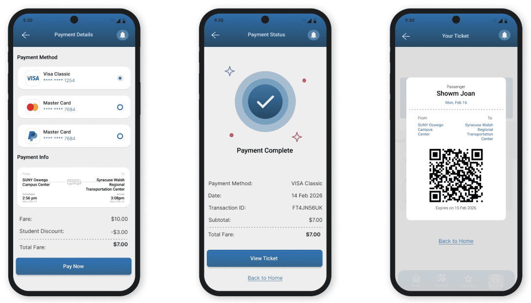
05 Student Id Integration
DESIGN DECISIONS
Drawing from differebt transit applications, to shape the user experience that helps the user.

Ideation
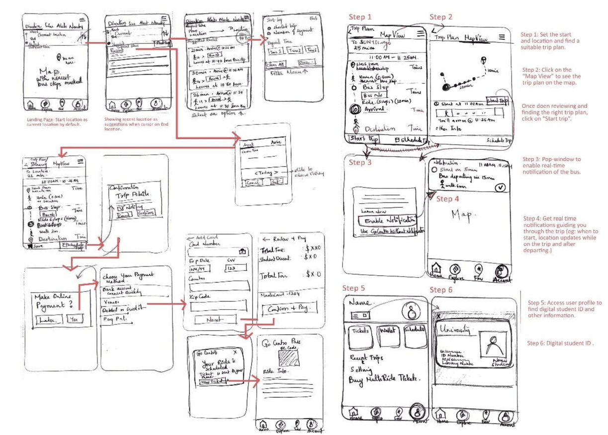
Taking inspiration I sketched layouts based on the different scenarios that were given before for an improved user journey.
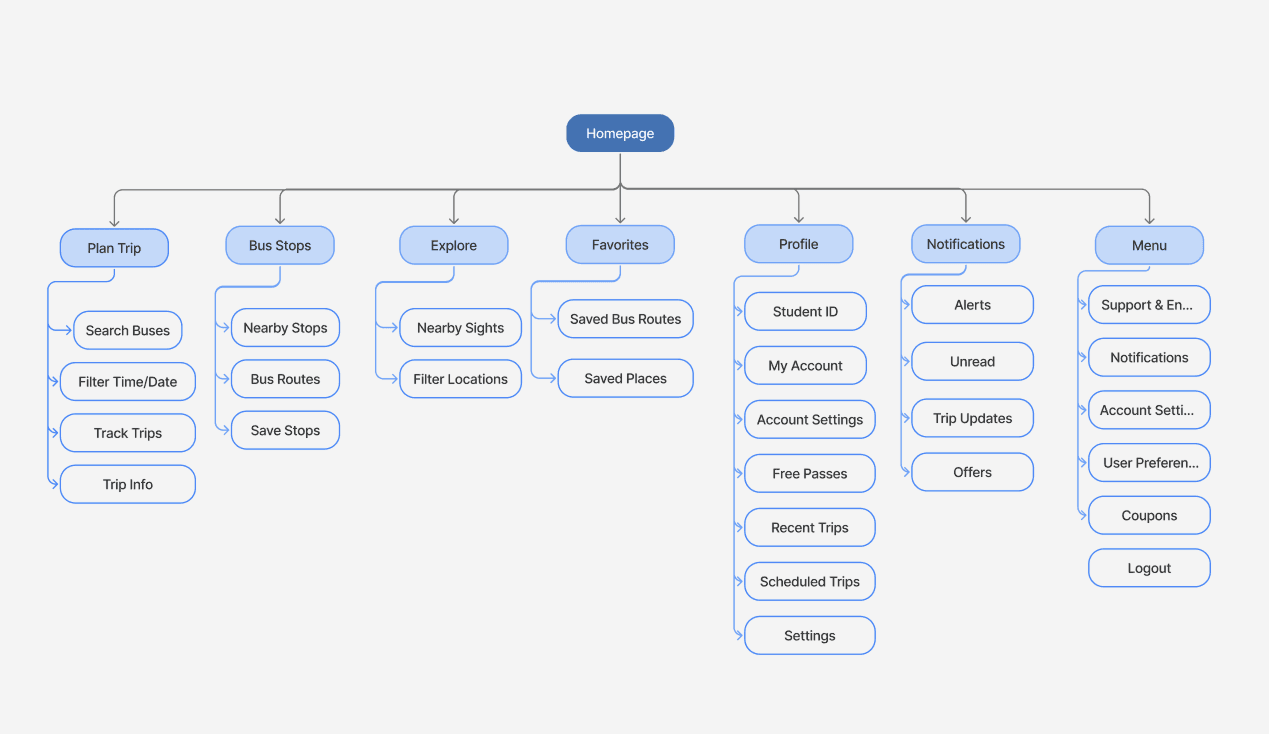
INFORMATION ARCHITECTURE
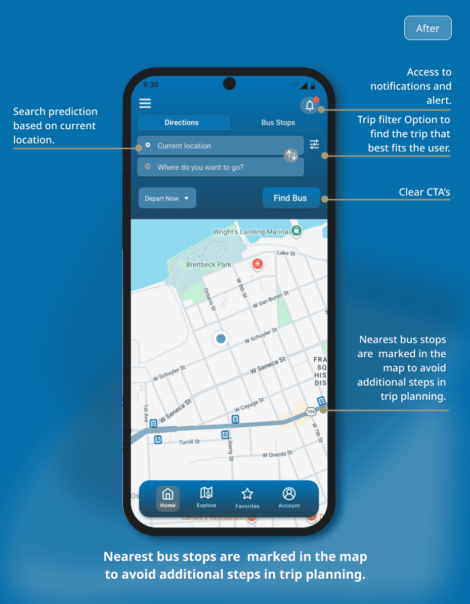
I mapped out how users move through the app, organizing content in a way that aligns with their mental models. This helped simplify navigation to enable users quick access to core features like trip planning, real-time tracking, and scheduling.
Mid-Fi Wireframes

Final Design






Reflection
This project taught me that meaningful UX improvements don't always require major redesigns. Small changes like refining icon placement, simplifying call-to-action labels, and reducing visual clutter can significantly improve the user experience.
It also reinforced the value of iterative design. Regular usability testing helped me prioritize pain points and make focused improvements instead of trying to solve everything at once.
Most importantly, I learned that great UX considers not just the interface, but also the real-world context in which people use it especially when they're commuting and relying on the app for quick decisions.
Let's build something worth remembering.
Great experiences are built through collaboration.
Whether you have a project in mind, an opportunity to discuss, or simply want to connect, I'd love to hear from you!
Feel free to get in touch by
sending a message.

@ 2026 Sumayya Sagheer. All Rights Reserved
Connect